DC has refreshed its stable of comics once again, putting its characters in new situations— and most of them have gotten a new look to celebrate. But as usual with superhero makeovers, some are less successful than others. So we’re going to put on our fashion-hats and rate what’s hot and what’s not in the DC Universe!
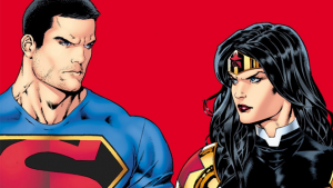
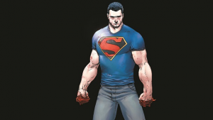
Superman
Pros: One of Superman’s big new themes going into this shake up is an attempt to humanise him a little more—reduced powers, an exposed identity, this is a Superman at his most human. So his uniform has been informed likewise: gone is the cape, gone is the suit. Instead, this Clark Kent jumps around in a branded Supes T-Shirt and jeans. Let’s be real though. The best thing about this update is that we’ve briefly tossed aside one of the biggest faux-pas of the New 52 redesign: the dreaded lack of red pants on the outside of Superman’s suit.
Cons: This is definitely one of the most radical changes in the line up, but at the same time… it’s just a bit boring. Nothing particuarly screams “hero” about a T-shirt and jeans. If anything, Clark looks like an extremely buff Superman fan rather than Superman himself. But the most egregious change for me? The haircut. Getting rid of the Classic Clark Curl has happened a few times before, but I’m not sure I can handle a buzzed Superman.
Rating: Three Buzzcuts out of Five
Batman
Pros: Batman’s look is iconic, yes. That’s kind of the point. But I kind of love the insanity of doing something so extreme with the Batsuit—and turning it into this Police-branded mechsuit with Bunny ears is definitely insane.
For the more faithful Bat-Fan, our new Batman Jim Gordon also has a far more traditional Batsuit (also sans cape—did DC hire Edna Mode recently?) that he wears inside the suit—and it looks very slick.
Cons: Allow me to be a bit contradictory. While I like that this new Batsuit is doing something we’ve not seen done with the Batman aesthetic—one that’s changed so little over the years—at the same time, it’s too much. It’s comically proportioned, and feels way too “out there” to be something cooked up by the GCPD, and yes, the Bunny ears are nowhere near Batty enough.
Plus, the biggest con of all? For some reason, putting Jim Gordon into this suit has meant we suffer the most tragic loss of them all: his moustache is no more.
RIP, Jim’s Moustache.
Rating: Mechsuit – Two Robot Bunnies out of Five, Stealth Suit – Four Robot Bunnies out of Five
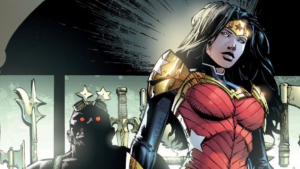
Wonder Woman
Pros: Now balancing roles as a Justice League member, the God of War and Queen of Themiscyra, Diana’s upgraded into something beyond her star-spangled short shorts and into something a little more battle-ready. Wonder Woman has never looked so ready to kick butt!
Cons: But… it’s also a bit egregious. The armor, while nice, also look awkward in places (especially at the pauldrons), and the wristblades are just ‘90s extremities that look out of place on the overall suit. I quite liked this look when it was announced—but honestly, what’s dampened it for me was seeing some of the original plans for Diana’s new look that DC unveiled recently. Turns out, there were much better ways to reduce the amount of exposed flesh on Wonder Woman and make her look like a modern character.
Rating: Two Wristblades out of Five
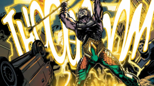
Aquaman
Pros: It includes elements of armor, without making it too bulky to make it unrealistic for someone who spends most of their time under water. This new Arthur Curry look is an Aquaman who’s ready to battle. The longer hair, tribal patterns on the armor and darker aesthetic also call to mind the character’s upcoming cinematic look.
Cons: Although I do like that they attempted to keep the original Aquaman colors, it clashes with the dark armor of the top half and makes Arthur look like he forgot the bottom half of his new outfit. Also, as several readers pointed out when this costume was unveiled, his new belt does an unintentionally hilarious job of highlighting Aquaman’s wang. Ooh err.
Rating: Three Bulges out of Five
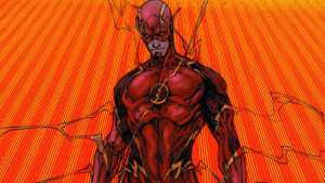
The Flash
Pros: Once again, another character design that draws on a live-action adaptation. The Flash’s new look adopts a similar two-scarlet-tone to the suit of The Flash TV show, breaking up the otherwise relatively plain costume in an interesting way—it even removes the white background from the Flash emblem, just like the show.
Cons: The one area the costume doesn’t borrow from The Flash is the bit that doesn’t quite work for me: The all-yellow boots clash much more against the darker reds than they used to. But the silliest thing has to be the over lightning effects that spread out of the costume when the Flash uses the speedforce now. It’s always been an element of the Flash aesthetic, but here, especially in the above image, it just looks like he’s exuding ‘90’s exTREEEEEEMEness out of his body. It’s a bit much, and not a great Speed Force representation, and it dampens the overall look of the Flash.
Rating: Three EXTREEEMES out of Five
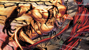
Reverse Flash
Pros: Speaking of The Flash, Professor Zoom’s new costume is pretty much going back to the classic look after the New 52 offered a radical, monstrous black-and-red alternative—one very much inspired by Harrison Wells/Eobard Thawne’s look on TV. Unlike the flash, the overt black lightning works perfectly for Zoom’saesthetic, and it matches up to his new suit nicely. He’s supposed to be extreme, he’s the Reverse Flash.
Cons: I don’t really have any qualms. Weirdly enough, thismight be my favourite new look of them all!
Rating: Four Reverse-EXTREEEMES out of Five
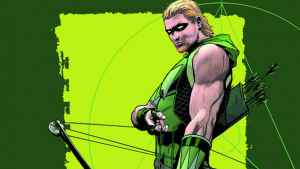
Green Arrow
Pros: The armored look of the New 52 has been eschewed for a more casual looking, svelte getup for Oliver Queen that probably works a bit more for the Emerald Archer. The dark green aesthetic brings to mind Arrow of course, but aside from that,it’s a decent changeup for Ollie.
Cons: Although the top and bottom halves of the initially revealed design were a bit disjointed, that’s been rectified as of Green Arrow#41, so I guess my major complaint for Green Arrow’s new look is once again, a hairy-one: and hoo boy, is Ollie’s new mullet reaching Arrow-Flashback-Wig levels of terrible. Thank god he still has a hood to put on, because without it we’d be looking at that damn mullet all the time.
Rating: You have failed this city. (Two out of Five)
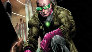
Lex Luthor
Pros: The floating disc-dealio he flies around on now is pretty cool, and I like that the garish Luthor color palette of neon green and bright purple (such a lovely, reserved fellow is our Lex) of his old bulky power armor has been maintained. Once again, Lex represents a sort of streamlining and bulking down that is a hallmark of this wave of redesigns. It certainly helps keep the characters looking sleek and modern.
Cons: This is almost a pro for me (I’m a bit weird), but the weird ‘90s cyberpunk look, right down to the ridiculous shades is such a clash with the otherwise modern approach that it looks hilariously silly rather than interesting. Plus, it’s one again the addition of a duster to body armor that puts me off. Seriously, DC. Stop trying to make this happen.
Rating: Two Dystopian Futures out of Five
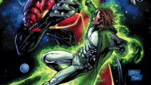
Green Lantern
Pros: It’s… got some green on it, I guess? Actually the lantern Gauntlet looks pretty nice, admittedly.
Cons: Oh, Mr. Jordan. This is not a good look for you. Gone is the classic lantern suit, replaced by a similar white body suit mostly covered up by a hooded duster that makes Hal look more like a magical space hobo than a defender of the galaxy. There’s too much going on, and honestly the acquiescence to “He’s the Green Lantern, there has to be green on him somewhere” has worked against the overall look. The bodysuit+tatty coat/cloak is a bit too much.
Rating: One Cosmic Hobo out of Five
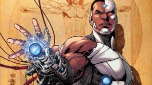
Cyborg
Pros: I commented when this look was revealed that it sort of looked like that new Terminator from Terminator Genisys, and that kind of look works for Cyborg extremely well. For a man mostly made of tech now, Cyborg looks slick and modern, after trimming quite a bit of excess armor. It’s a stripped down look, and it works excellently for Vic. The metallic muscular look really embodied the mix of flesh and metal that the character is, and it looks great.
Cons: Once again, another look I don’t really have any qualms with (unless people don’t want to be reminded of the new Terminator film? I guess the judgement on that will have to wait until it’s out.
Rating: Four T-800’s out of Five
And the Loser is…
For me, it’s gotta be Hal. I mean, I get what they’re trying to do—how it all ties into the idea of him being a renegade and all that, but it’s just a mess. I’ve repeatedly turned back to how some of these looks feel like they’ve leapt straight out of a ‘90s comic book, but I think that shines through the most in this new Green Lantern. It’s trying way too hard to look gritty and grim, and instead it just looks, well, ridiculous. Congratulations Hal Jordan, I guess!
Disagree? Think there’s a far worse (or far better) costume update out there in DC’s new comics that’s not covered here? As always, let us know in the comments.
Which DC Comics Character Has The Most Ridiculous New Costume?
